Case Study
Sleeve Stories: The History of Album Covers
A conceptual short-term exhibit identity, designed as a class project, imagining how the Milwaukee Art Museum could celebrate the evolution of album cover design through a cohesive visual system across print, digital, and 3D applications.
Project brief
For this project, I was tasked with creating a short-term identity system for a Milwaukee Art Museum exhibit centered on a theme from Communication Design history.
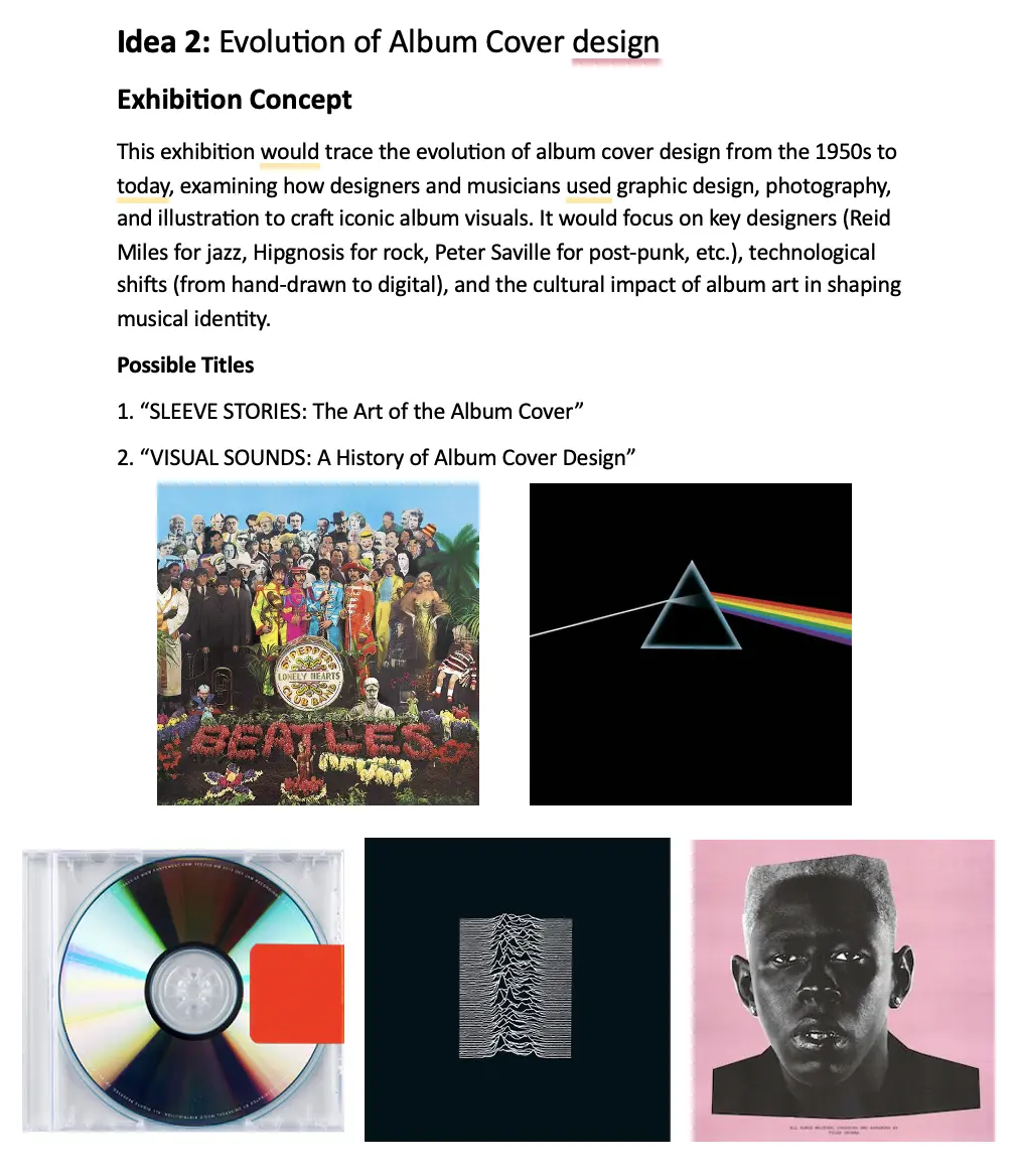
I chose to explore the evolution of album cover design, a visual art form that captures the intersection of music, culture, and design innovation.
The challenge was to design a cohesive system that honors the analog legacy of album artwork while appealing to modern audiences. The identity needed to reflect music’s visual storytelling power, bridging eras of vinyl, CD, and streaming culture into one unified aesthetic.

Research & early directions
I began by researching how album artwork evolved from the 1950s onward, studying designers like Reid Miles, Peter Saville, and Storm Thorgerson. These references helped me understand how typography, color, and composition communicated not just the music but an artist’s entire persona.
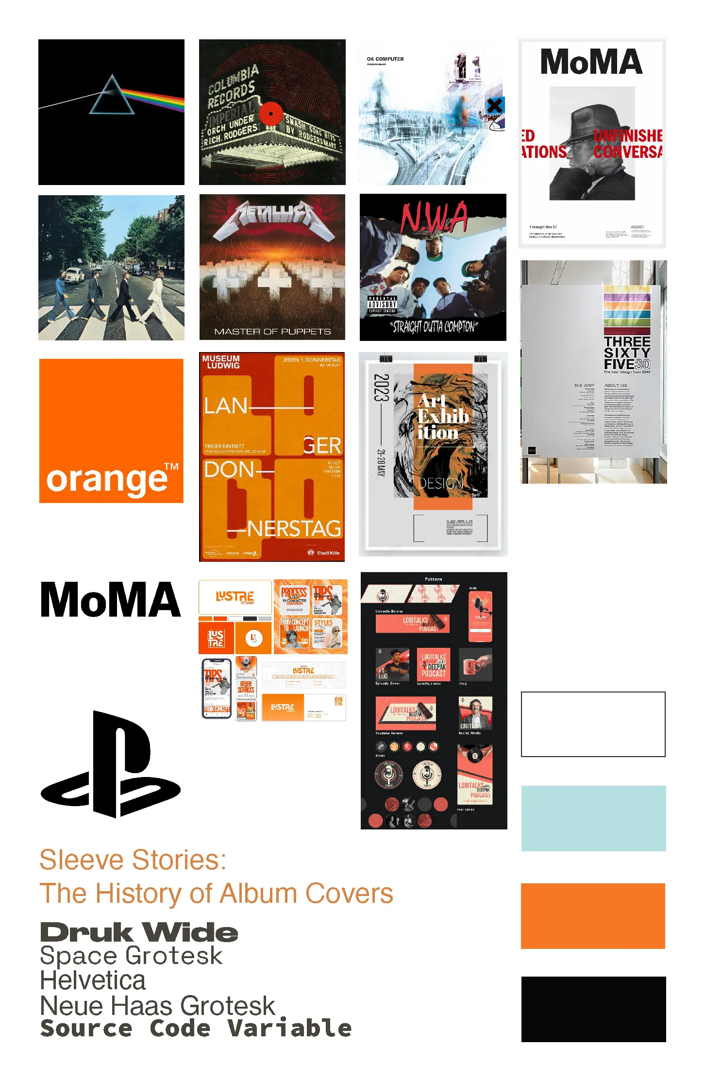
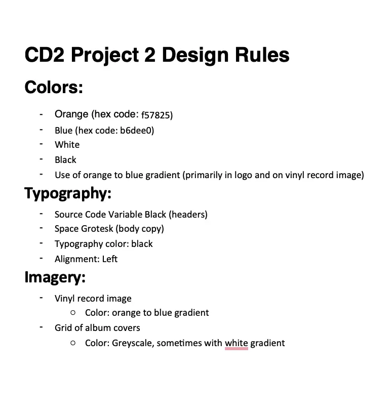
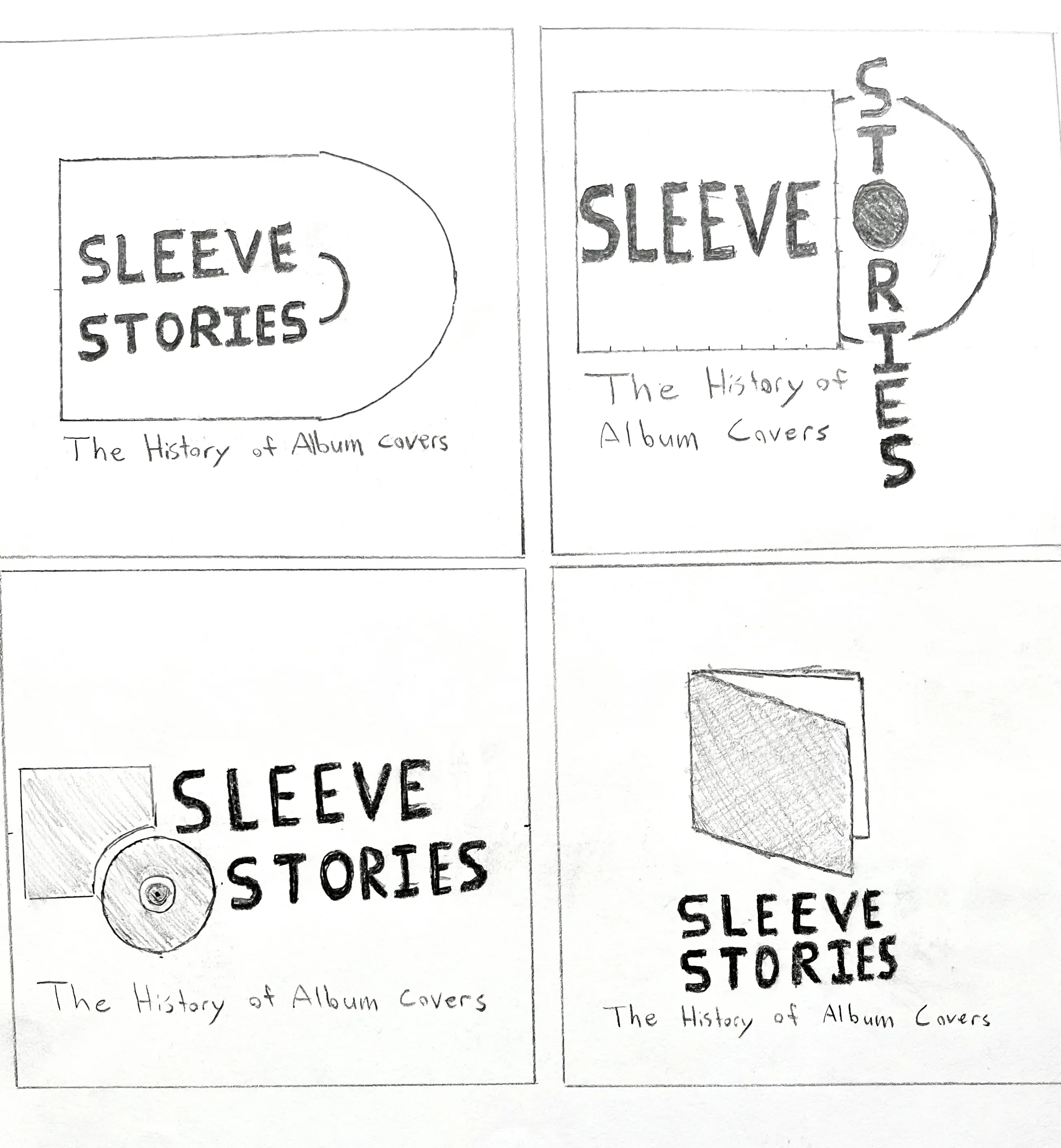
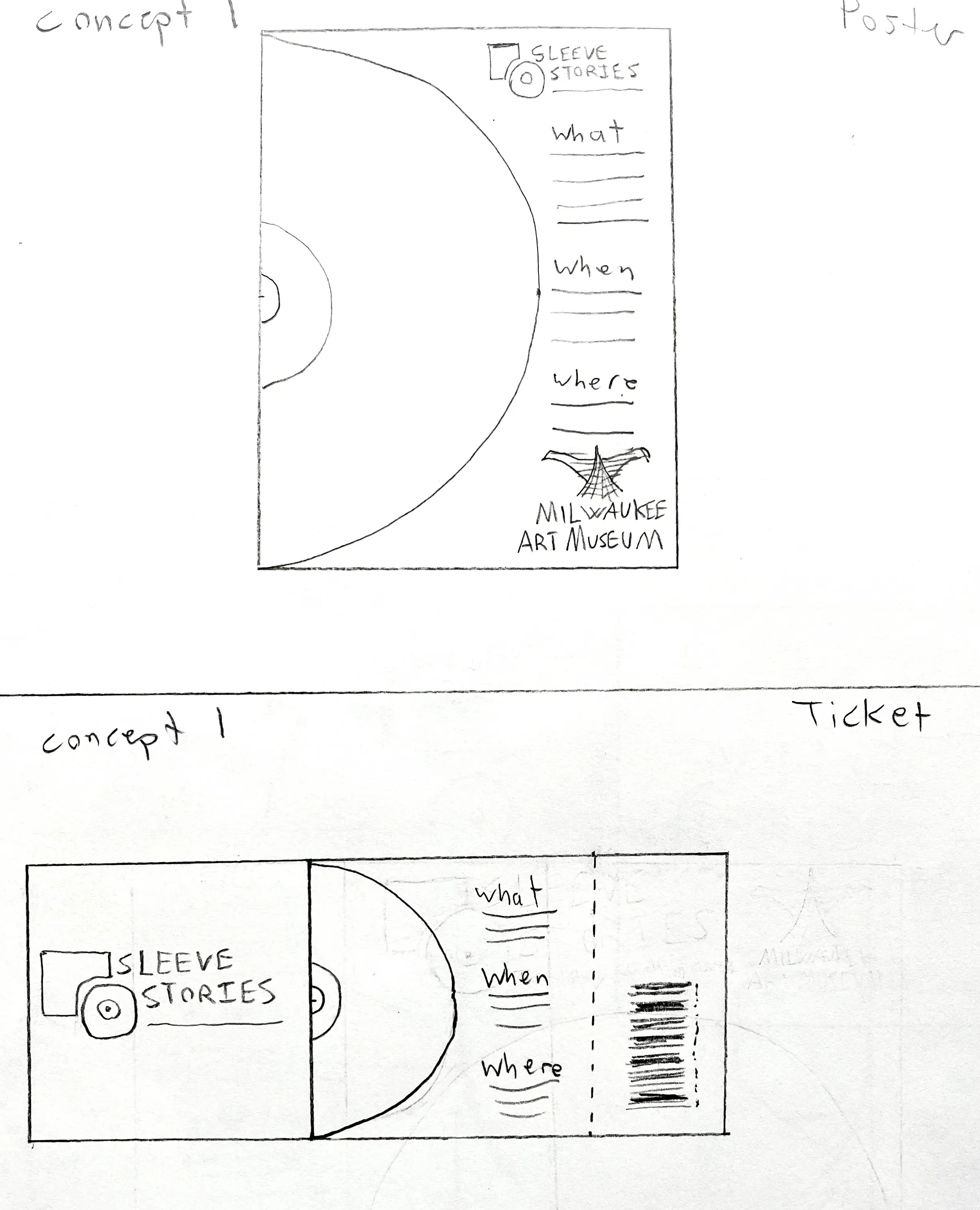
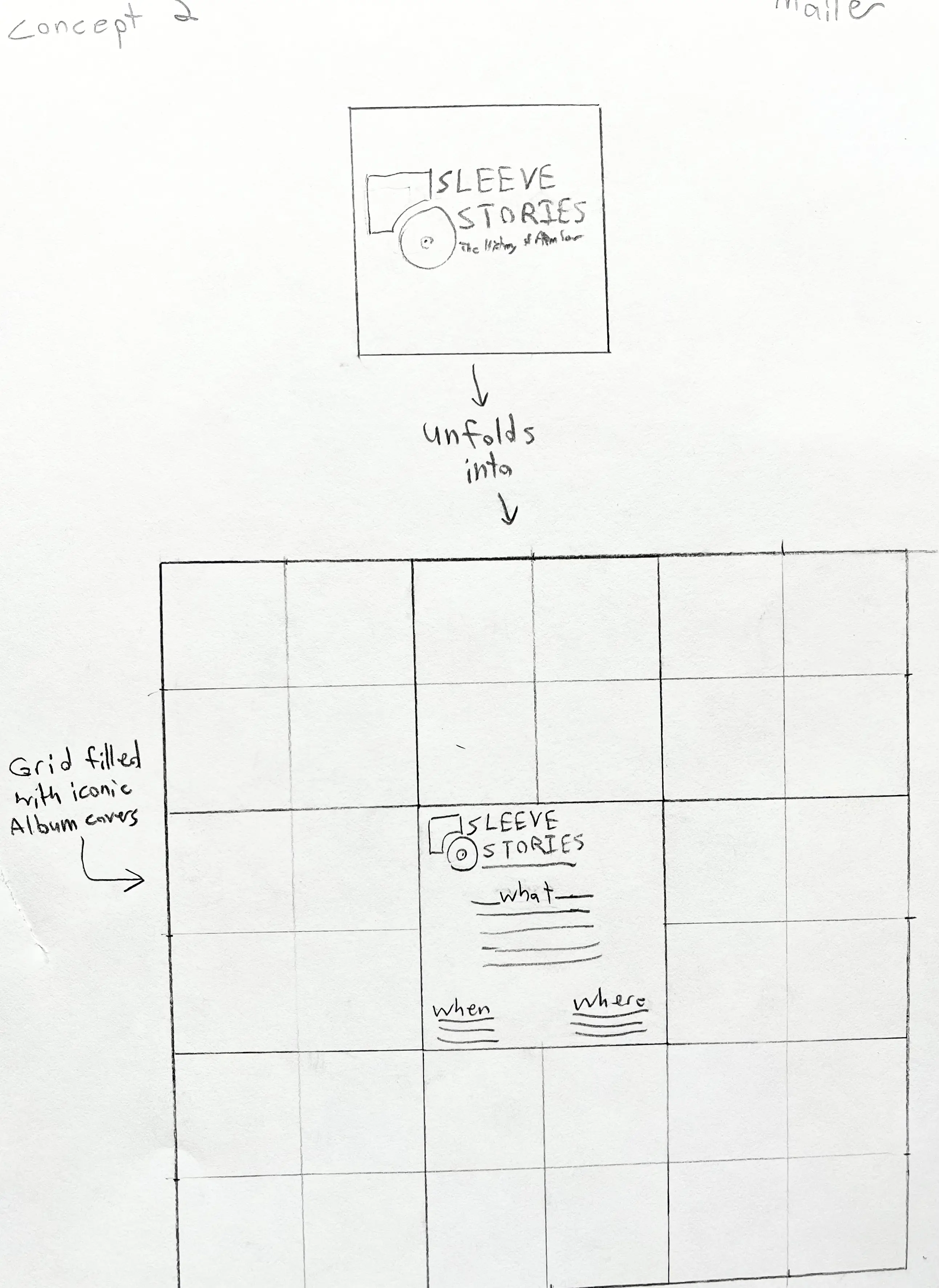
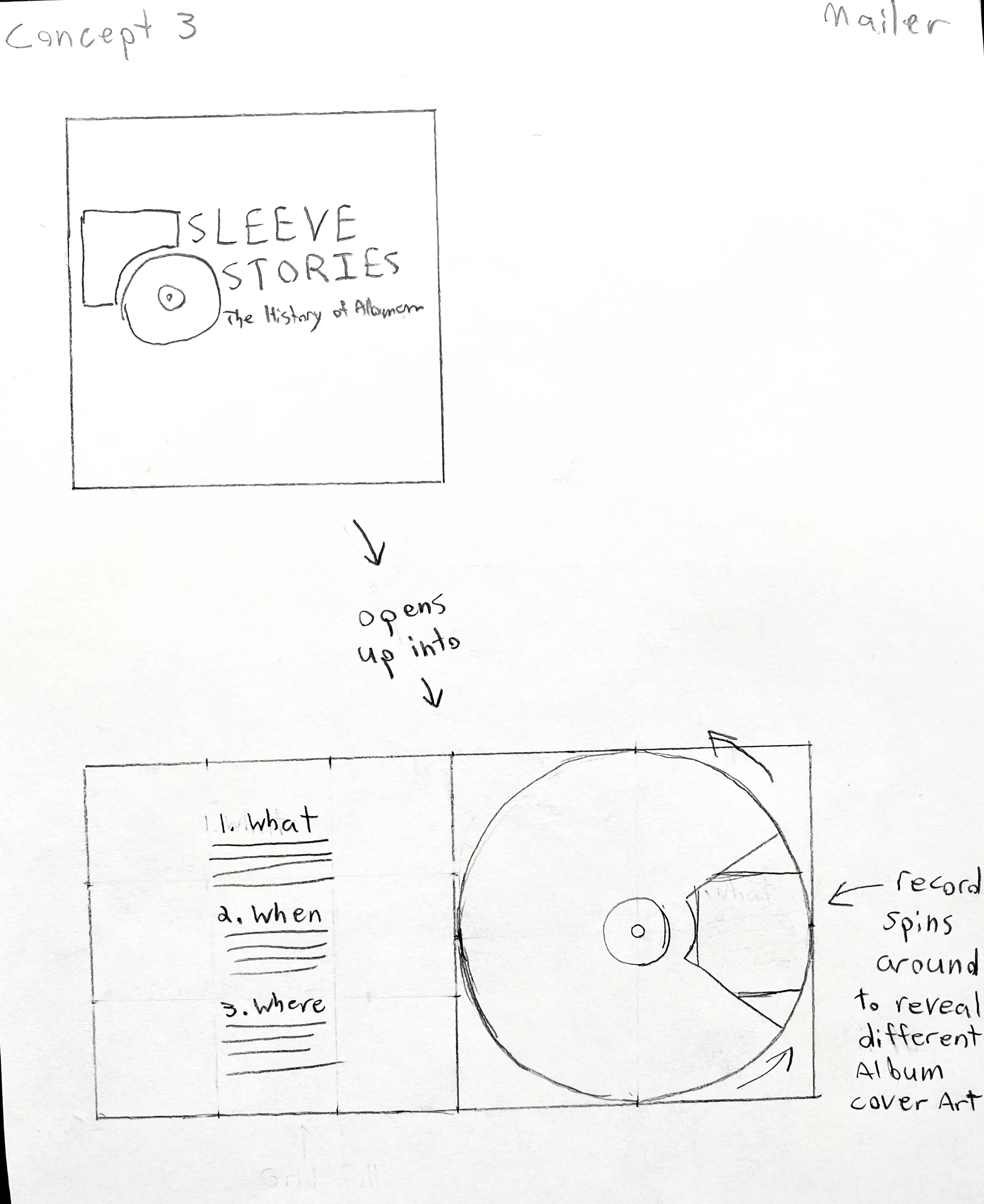
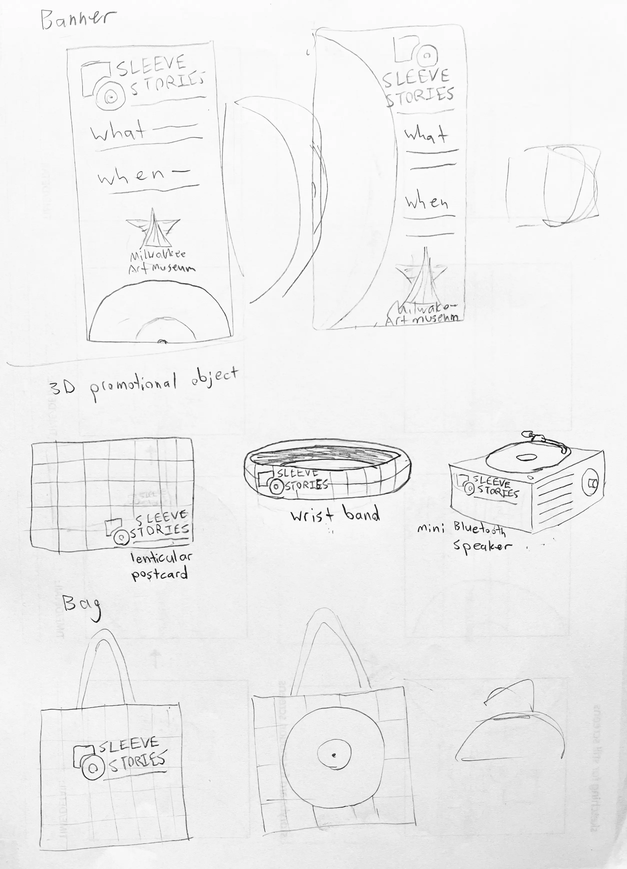
To ensure visual consistency across all pieces, I developed a cohesive design system that unified the project’s type, color, and layout rules. I began by creating three distinct concepts for the major deliverables: poster, mailer, ticket, and banner, each exploring different ways to visualize the relationship between music and design. Using moodboards and hand-drawn sketches, I tested how imagery, hierarchy, and rhythm could connect the identity across print, digital, and 3D applications
After evaluating each direction, I selected the strongest concept and refined it into a flexible system. This included consistent use of the vinyl gradient motif, bold sans-serif typography, and the album cover grid background, which together maintained a unified visual voice throughout every element of the campaign.
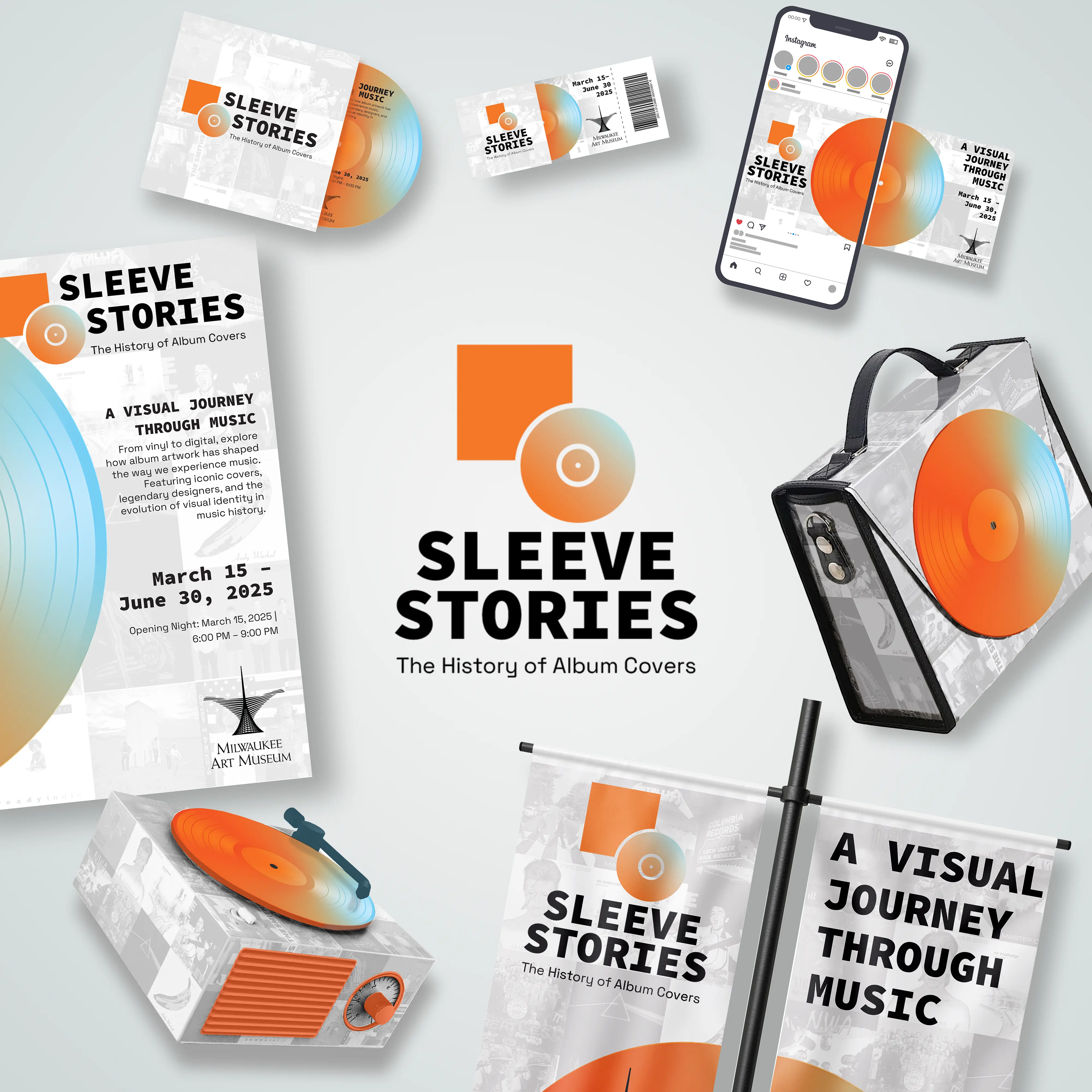
Design system
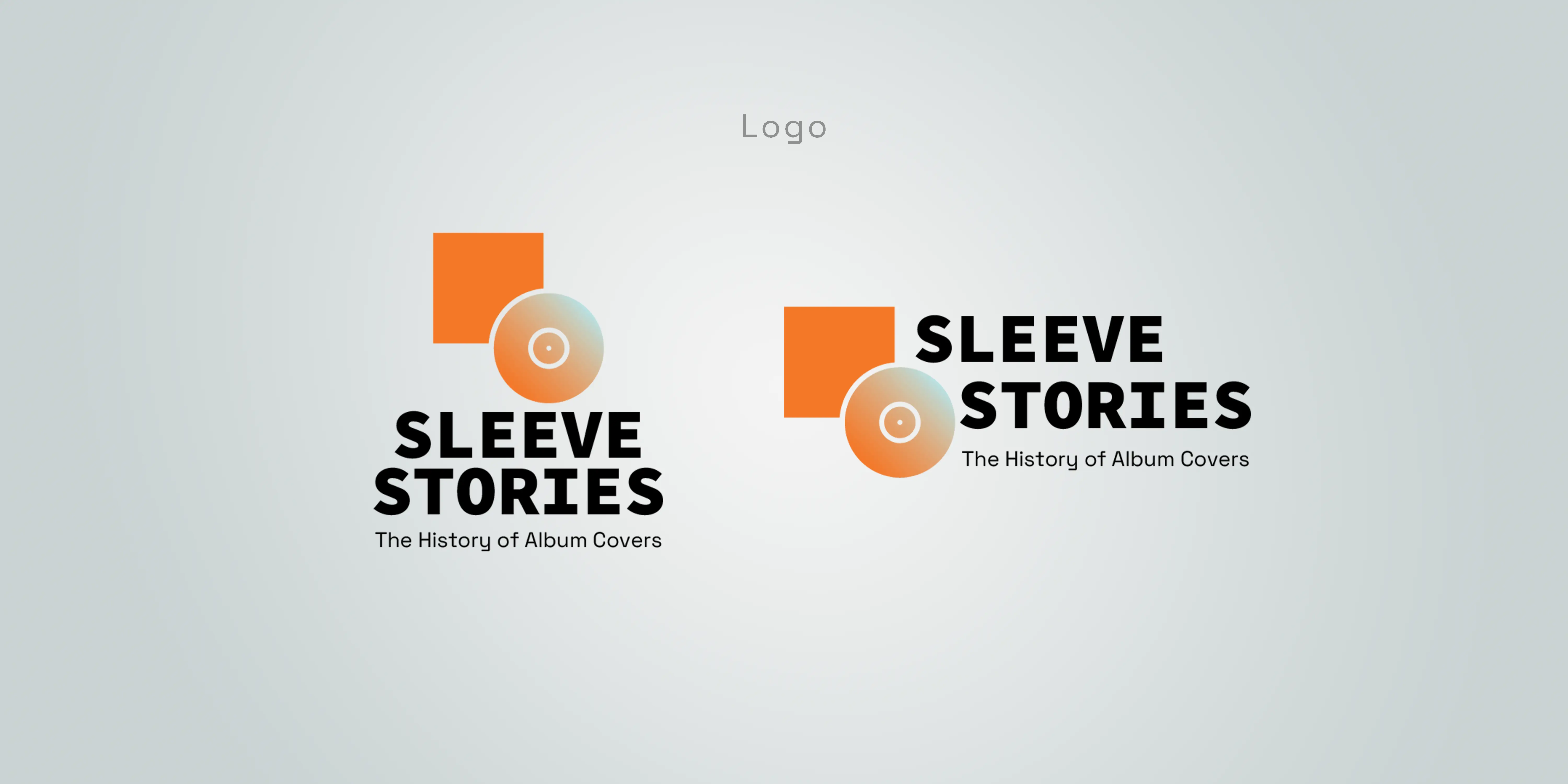
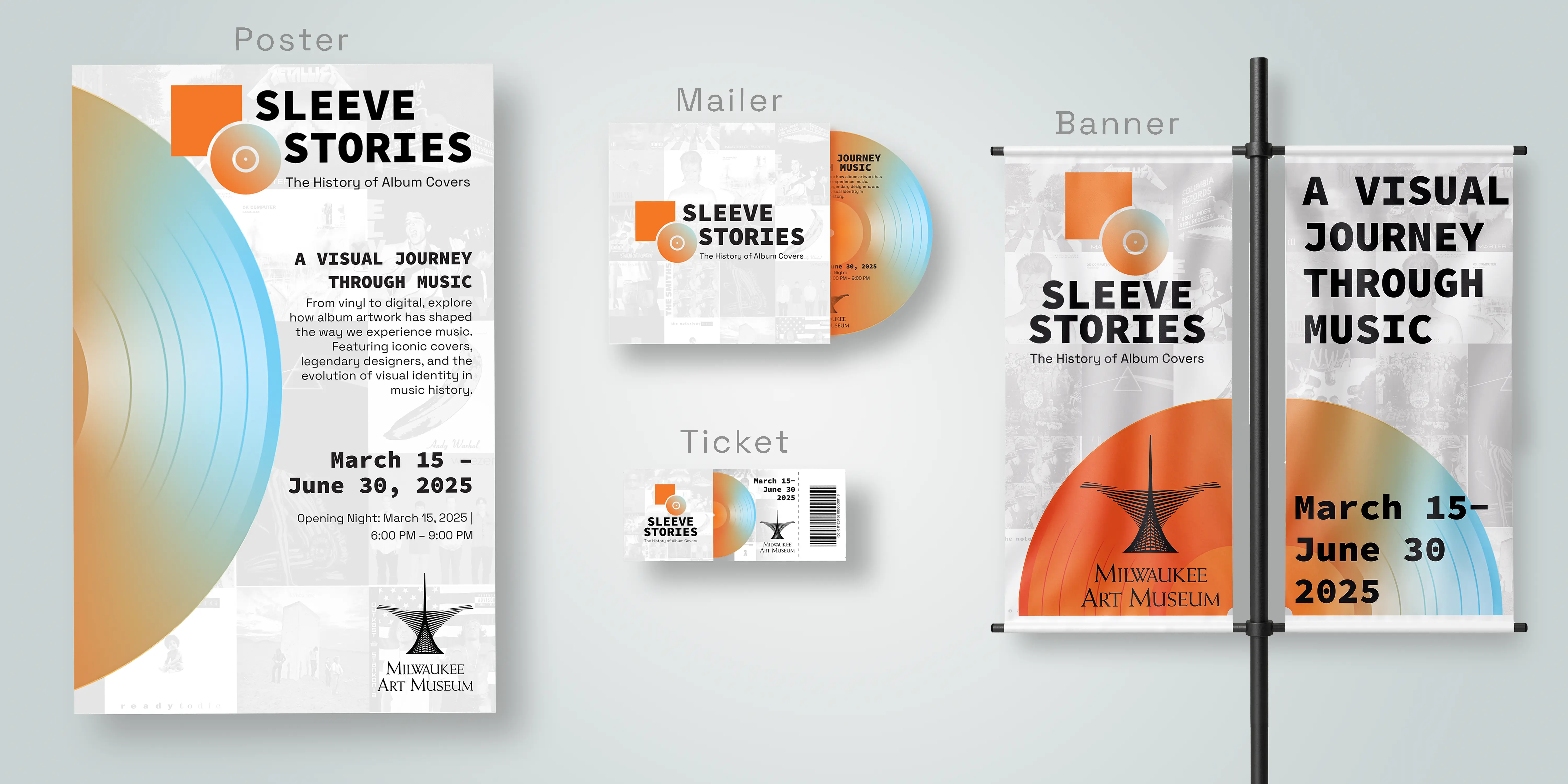
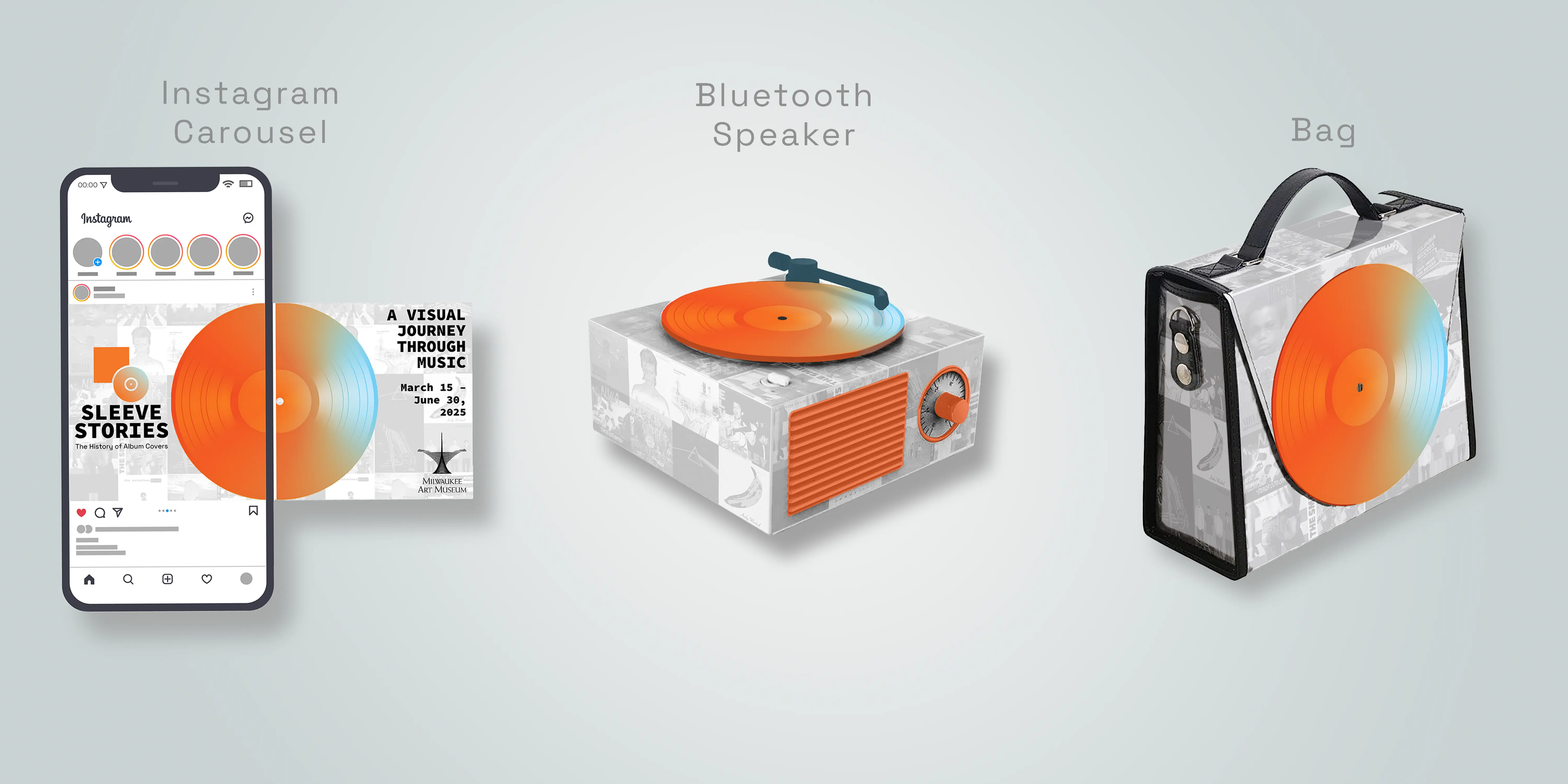
The final logo centers on a geometric circle, evoking a record, paired with a bold square that acts as the “sleeve,” visually representing the title Sleeve Stories. For texture and depth, I designed a watermark-style background grid of iconic album covers, set to low opacity. This subtle collage connects the exhibit to its subject matter without overwhelming the main design elements. The background acts like a visual echo, reminding viewers that every new cover is built on decades of design history.
The color palette features deep orange and soft blue gradients, inspired by vinyl reflections and music’s warmth and rhythm. Paired with clean black typography, the system feels both modern and nostalgic.
Deliverables included:
- Logo system
- 11x17 poster
- Mailer and ticket design
- Instagram carousel with motion
- 3D promotional item (Bluetooth speaker)
- Gift shop bag
The completed identity, Sleeve Stories: The History of Album Covers, tells a visual story about music’s design legacy. Each component, from print to digital to 3D, reflects the exhibit’s core idea: that album covers are art forms in their own right, shaping how we see and experience music. The gradient “record” motif and background grid of classic covers tie every piece together, posters, banners, tickets, and social media graphics, into a cohesive and memorable system. The final designs create a sense of movement, rhythm, and layered storytelling that mirrors the experience of listening to an album itself.
What I learned
Through Sleeve Stories, I learned the importance of creating a design system that functions seamlessly across multiple forms of media. Developing this project taught me how consistency in typography, color, and composition builds recognition while allowing flexibility for different contexts, from printed posters to digital carousels and 3D promotional pieces. I realized that a well-structured system not only ensures visual harmony but also makes it easier to expand and adapt a brand without losing its identity.
It also helped me refine my process, from research and sketching, to digital refinement and mockups. And it showed how storytelling can guide visual decisions at every stage of a project.